CORE Mobile Web Redesign

Improving the mobile website of a globally recognized research centre to help improve the future of ocular research.

Project Outline

OVERVIEW
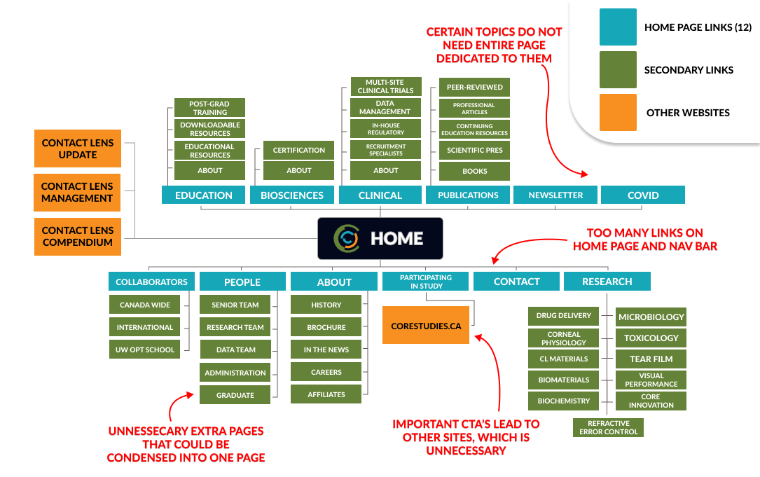
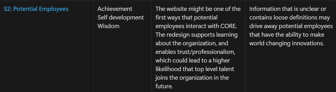
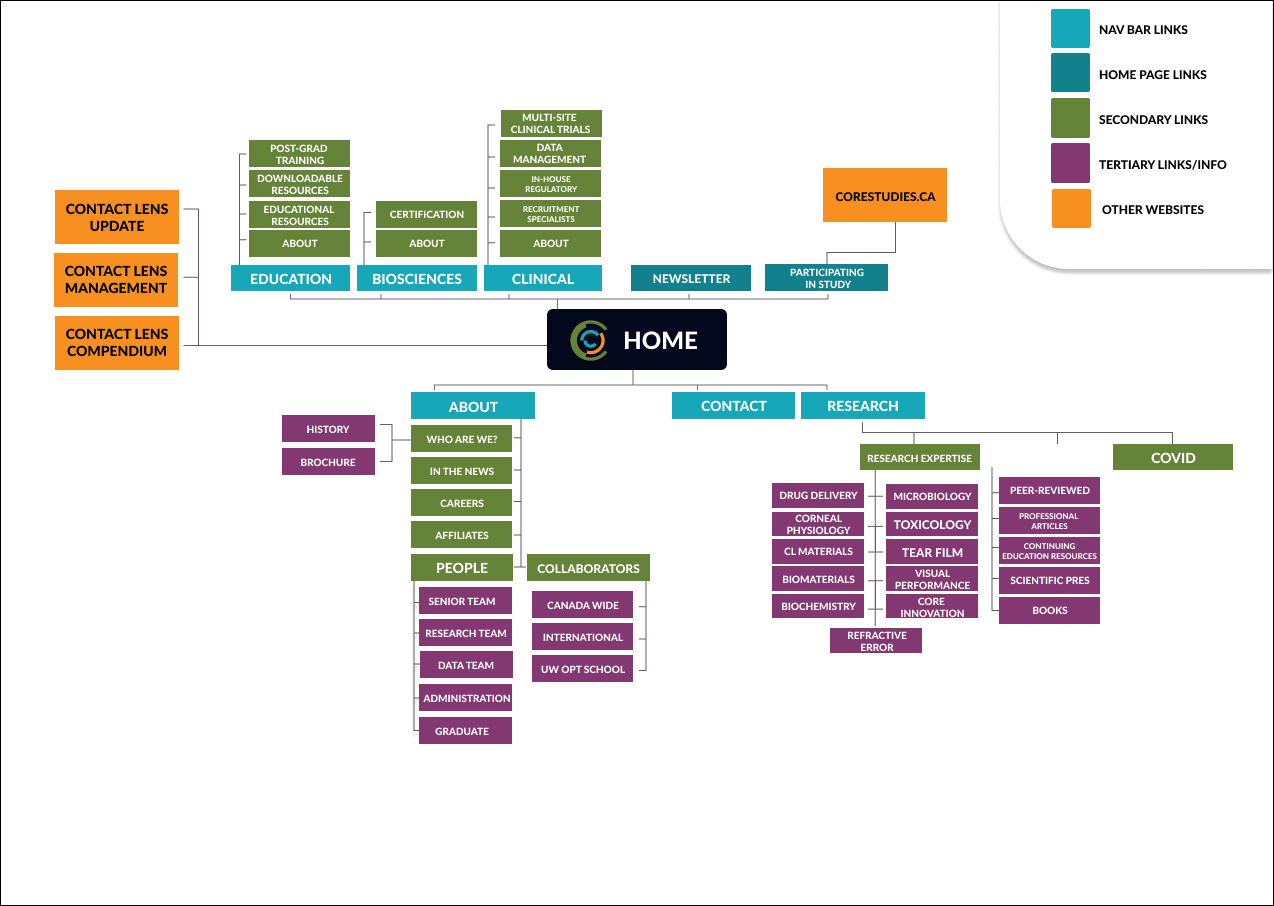
This project involved revisiting a previously completed design project that required improvement. Using the Value Sensitive Design (VSD) framework, I analyzed how stakeholder values were initially overlooked within the design and identified opportunities for improvement. I chose to improve my conceptual website redesign for the Centre for Ocular Research and Education (CORE), based on my experience working with them during my Fall 2024 co-op. Throughout the length of the semester, I was able to elicit and incorporate stakeholder feedback into my design, leading to a more efficient and value-oriented product.
CLIENT
Centre for Ocular Research and Education (CORE)
TIMELINE
JAN - APR 2024
ROLE
Research, wireframing, prototyping and user testing
PROJECT TYPE
Conceptual
CHALLENGE
"Create a company website that better fit the needs of multiple stakeholders"

The challenge involved redesigning CORE’s outdated website, which suffered from poor information architecture and failed to effectively communicate the organization’s mission, research activities, and opportunities. This limited its ability to attract research participants and potential employees, ultimately undermining stakeholder trust and engagement. The project needed to adhere to strict ethical standards set by the University of Waterloo, requiring clear, professional, and low-hyperbole content.

Research

BRAND INSIGHT
Taking place during my first work-term in September of 2024, I was hired as a Digital Marketing Specialist for CORE, a world renowned research clinic that has been responsible for the development of many contact lenses, dry eye therapies, and related products, which are relied on by consumers worldwide.

CORE's main purpose is to conduct independent research studies to test new ocular products, such as new material for a contact lens, paying residents of the Waterloo area to become participants. When a new study is created, eligible participants are selected from CORE’s database of over 6,000 people and asked to participate. Recruiting new volunteers to grow this database is paramount to ensuring the success of these studies, as well as maintaining CORE’s international status as a reputable and dependable research centre.
ISSUES WITH CURRENT WEBSITE
CORE"s current website has a lot of potential to be great in both aesthetics and function, but fails to meet some fundamental web design principles. Below is some key issues I found during my analysis as well as a breakdown of why their current site layout does not work.
• Poor image selection, ineffective font choice and outdated design elements created poor brand image
• Topics that need priority are led astray from user due to overbearring amount of options to click on
• Lack of clear CTA's to support the research studies, which should be number 1 priority
• Unprofessional and even untrustworthy (huge deal)
• Poor website layout, leading to confusion and friction
IDENTIFYING STAKEHOLDERS 
Before I could start finding issues with the website, I needed to identify the direct and indirect stakeholders that the website is currently affecting. At first, these stakeholders were created from past experience and a small amount of secondary research and are meant to be updated after meeting real individuals that fall under these groups. From the list of stakeholders that I had created, I chose two to serve as the personas for the redesign, with a heavy focus being put onto their projected values. Here are the two stakeholders that I ended up choosing for my persona.
USER INTERVIEWS
Using the persona that the stakeholders provided, I had to find a couple of people that would fit into either group. I was able to find two people that matched the description of "Potential Research Participants" persona, and three people that matched the description of the "Potential Future Employees" persona. In order to ensure that my presumptions about my stakeholder's values were empirically sound, I employed a method that combined two traditional user tests together; those being a semi formal interview and a subsequent user test with CORE's current website. I started with the semi-formal interview in order to establish a base of rapport and understanding between me and the interviewee, mostly about what I was trying to achieve with the interview itself and what my overall topic was centered around. After 3/4 of the interview was complete, I would introduce the website to the user and assign them a task to complete. I asked for the user to follow the speak aloud method while maneuvering through the task, which would enable me to understand their first impressions of the design itself. After the task was complete, the interview would resume and I would follow up with questions focused on their experience with the website, narrowing in on what values they felt were present and at what parts. Users from stakeholder 1 were asked questions that centered around their decision making process for buying or using medical devices (such as contact lenses) whereas users from stakeholder 2 were asked questions regarding employment preferences.
INSIGHTS FROM INTERVIEWS
• Users reported not knowing what to do when browsing the website, lacked a sense of purpose for CORE
• Users found it hard to navigate the site both functionally and visually
• Stakeholder 1 Values: Two values remained the same (trust & safety) however, the third value (transparency) was swapped out for achievement
• Stakeholder 2, two values remained the same (achievement & wisdom) however, the third value (self development) was swapped out for security

Prototyping

LOW FIDELITY PROTOTYPES
Now that my preliminary research had been completed, it was time to start developing a low fidelity prototype to be used for more testing and ultimately kickstart the redesign. Keeping the new listed values in mind, I first created a new site map for the website and then used it to help guide the development of the low fidelity prototype.

User Testing

USER INTERVIEWS ROUND 2
Now having a testable and functional prototype for my redesign, I could now test the same users that were interviewed to obtain even deeper insight into what they truly want from this website. For stakeholders, I reused a slightly modified version of the semi-formal interview and then asked them to use the new prototype. After the walk through was complete, the interview would resume and I would follow up with questions focused on their experience with the website, narrowing in on what values they felt were present and at what parts. To gain further insights, I also conducted informal interviews with multiple classmates with hopes of acquiring technical feedback on the website's layout and features. I first informed them on the goals of my project and the organization itself, and then I asked them to go through the prototype and list any changes they would want to make. Down below are the main insights I was able to derive from my users and classmates.
FEEDBACK
• Include some sort of back button to help improve site navigation efficiency
• Use statistics or major achievements from current website more frequently to improve credibility and promote the values of trust and achievement
• Include more images in the design, especially on the about page
• Improve some of the copyright to play into the values more. Emphasize values within the word choices

Results

FINAL PROTOTYPE
The final version consisted of a highly tailored and value-driven redesign of CORE’s website which successfully promoted stakeholder values. This project demonstrated how even good designs can falter if they are not properly aligned with users. This final prototype achieved a 100% in my GBDA 306 course, which I am extremely proud of. Here is the final prototype below.  

Reflection

01. IMPORTANCE OF STAKEHOLDER VALUES
This assignment provided me with a new look on user first design, which I can attribute to it's focus on stakeholder values. Analyzing different ways to elicit and promote these values throughout the design brought me to design each element with a level of attention and focus that I didn't know was possible. Honing in on the values of the stakeholders was paramount to the success of the redesign, and something that I wish I had focused on earlier.
02. REITERATIONS ARE KEY
I found myself redesigning elements which I thought were complete many times throughout this assignment, and when I look back at this process, I am entirely grateful for it. So many of my initial designs were completely undeveloped and if I had just assumed that they were complete, my final prototype would've sufferred.
03. FEEDBACK IS IMPORTANT AT EVERY STEP
Almost every point of feedback I received was not only constructive, but also eventually implemented into the final design in some way. I think that for future projects, I will be asking for more feedback as early as possible, as I now understand just how important it can be.  

Wanna get in touch?

Let's Connect !